Most of them are outdated, but provide historical design context.
They are not user documentation and should not be treated as such.
Documentation is available here.
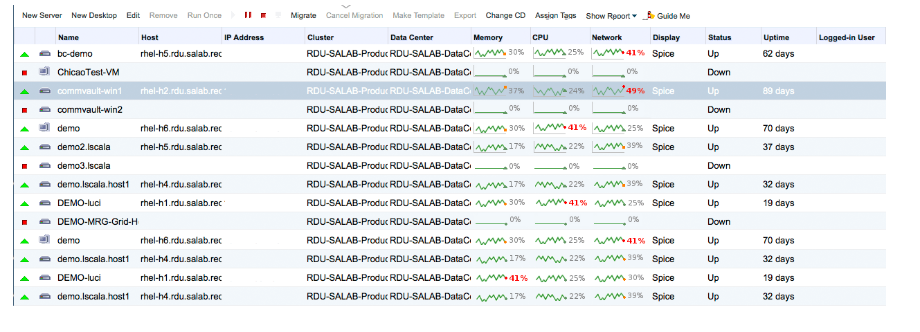
Resource Usage Graph
Summary
Implement a line chart showing a short history of the resource usage.
Owner
- Name: Tomas Jelinek (TJelinek)
- Email: TJelinek@redhat.com
Current status
- Target Release: 3.6
- Status: done
Background
Up until now, the resource (CPU, memory, network) usage of the VM was shown only as a current state with no historical view.
It would be good to replace the current visualization with a line chart.
Implementation
To store the short term history the vm_statistics table has been enriched by the following fields:
- cpu_usage_history
- memory_usage_history
- network_usage_history
This fields are defined as TEXT and the values in them are stored as one comma separated string of values in percentage, for example: “19,20,34,0,0,1”
The amount of values which are stored in this fields are regulated by UsageHistoryLimit from vdc_options. For example, if the UsageHistoryLimit is 3 and the current value is “1,2,3” and the new value of 4 comes, the result will be “2,3,4”.
Frontend
A line chart will be added (implemented using the HTML5 canvas with a fallback to the old way of visualizing if the browser does not support it) The widget’s specific behavior (in case the browser supports HTML5 canvas):
- the widget draws a line chart ending with a green triangle (if the last value is smaller than 70), orange square (if smaller than 95) and a red dot (if bigger than 95)
- next to the chart is a the last value of the chart written in form of N% (e.g. 75%). If the value is >= 95, it is red and bold
- if the num of progress values is smaller than the amount fitting into the drawing area but does not start with 0, the values are prepended by ‘0’ e.g. the chart will start from 0
- if the num of progress values is bigger than the amount fitting into the drawing area, beginning of the values are cut
- the distance between two points has to be between the 4px and 15px (calculated according to the width of the drawing area and num of of points in the chart) - e.g. the bigger the drawing area the more points can fit in. It will also react to table column resize.
- if no points fit into the drawing area, only the number is shown
Please see the mockup attached (please note that the line endings are random in the mockup):
Testing
Test Case 1
- Have a VM which is turned off
- Verify the line charts reset to 0
Test Case 2
- Have a VM running some while so the charts are showing something
- Turn the VM off using webadmin
- Verify the charts are reset to 0
Test Case 3
- Have a VM running some while so the charts are showing something
- Kill the qemu process of the VM
- Verify the charts are reset to 0
Test Case 4
- Have a VM running for some time so it has, say, 10 values shown in the CPU usage chart shown
- Make the CPU usage column small that not all the values fit in
- Verify that only the subpart of the values are in
Test Case 5
- Have a VM running for some time so it has, say, 10 values shown in the CPU usage chart shown
- Make the CPU usage column large that all the values fit in
- Verify that all of the values are in
Test Case 6
- Have a VM running for some time so it has, say, 10 values shown in the CPU usage chart shown
- Make the CPU usage column very small
- Verify that only the number showing the actual usage is shown
Test Case 7
- Have a VM running for some time and has a changing values in the CPU usage
- Verify that when the CPU usage is under 70%, the line chart ends with a green triangle, if between 70 and 95 than orange square and if above 95 a red dot
- Also verify that if the current value is under 95% the number showing the actual value is not bold while when above 95 it is red and bold