Most of them are outdated, but provide historical design context.
They are not user documentation and should not be treated as such.
Documentation is available here.
Branding Support
Owner
- Name: Alexander Wels (awels)
- Email: awels@redhat.com
Overview
The oVirt user portal and web admin recently obtained new functionality to allow one to partially skin/override some of the existing styles. This document gives a description of what is change-able and where to look to make it happen. The purpose of the current implementation is to prove the framework and give some basic styling abilities as well as some ability to change some of the messages. As the user portal and web admin are both web applications developed in GWT, they use standard cascading style sheets (CSS) to style the application. GWT does some magic to in-line styles to make them available faster, so to allow external styles takes a little bit work.
The current implementation gives the ability to change some of the styles in the following elements of the user interface:
- pop-up windows
- the login screen
- the main header part of the user interfaces
- Some of the tabbing tabs.
If needed we can increase the number of style-able elements in the future.
Some of the user interface elements that can be styled is shared between the two applications. One can style them independently or one can share the styles between the application. This is usually done by importing a common style sheet file into the main style sheet file of the application.
It is also possible to change some of the messages displayed to the user. These messages include ‘branding’ type message. Basically everything you see that says ‘oVirt’ something can be changed to say something else. This allows one to brand oVirt for their own company or anything you want.
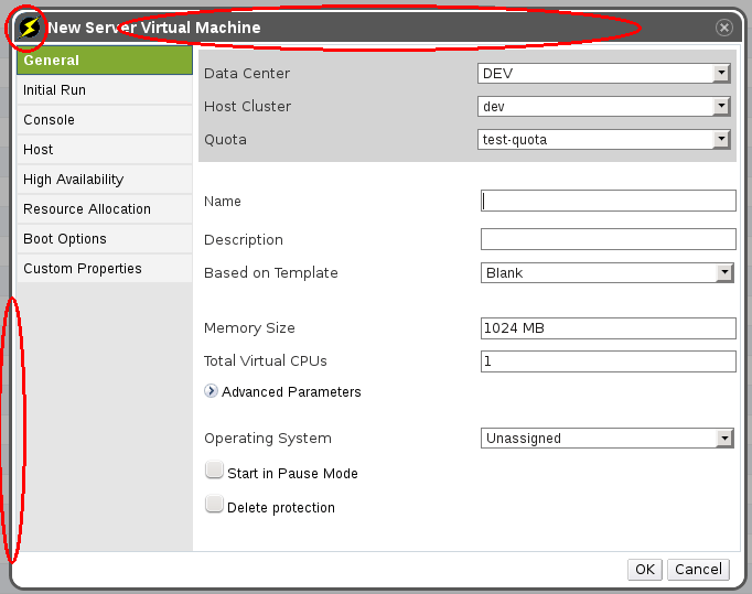
Pop-up windows
Popup windows include anything that allows you create/edit/update a particular entity such as hosts, VMs, etc. You can change the following attributes of pop-up windows:
- Border
- Header image on the left
- Header center image (repeated)
As illustrated by the following image:
 As the oVirt default branding is itself a branding theme you can look at the oVirt branding in
 packaging/branding/ovirt.branding in the source tree to see which css classes are available. The classes for the popup window are in ovirt_common.css and gwt_common.css
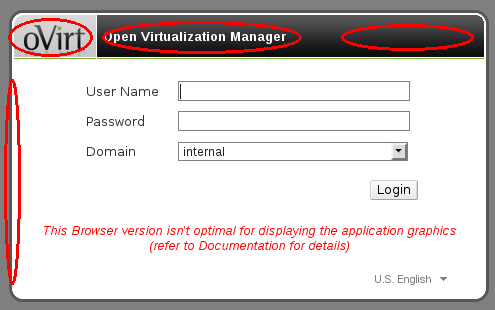
Login Screen
The user portal and web admin share the same login screen, so in the default branding style they share the same classes. You can change the following attributes of the login screen:
- Border
- Header image on the left
- Header center image (repeated)
- Header right image
- Text in the header center
As illustrated by the following image:
 As the oVirt default branding is itself a branding theme you can look at the oVirt branding in
 packaging/branding/ovirt.branding in the source tree to see which css classes are available. The classes for the login window are in ovirt_common.css and gwt_common.css
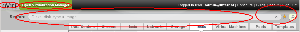
User portal main header
The user portal main header has the following attributes that can be changed:
- Logo
- Center background image
- Right background image
- The border around the main grid
- Text right above the ‘logged in user’ label.
As illustrated by the following image:
 As the oVirt default branding is itself a branding theme you can look at the oVirt branding in
 packaging/branding/ovirt.branding in the source tree to see which css classes are available. The classes for the user portal header are in ovirt_user_portal.css
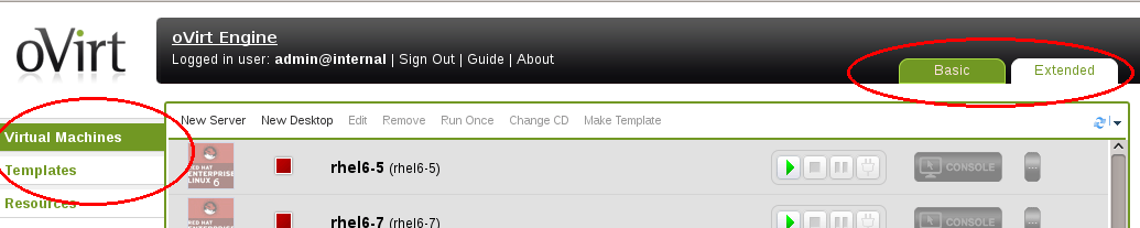
Web admin main header
The web admin main header has the following attributes that can be changed:
- Logo
- left and center background
- right background
- Text to the right of the logo
As illustrated by the following image:
 As the oVirt default branding is itself a branding theme you can look at the oVirt branding in
 packaging/branding/ovirt.branding in the source tree to see which css classes are available. The classes for the user portal header are in ovirt_webadmin.css
Tabbing elements
There are two types of tabbing elements in the user portal. The main page tabbing elements (to switch between basic and extended) and the tabs on the left side of the screen when you have the extended tab selected. The following attributes can be changed:
- Active tab
- Inactive tab
As illustrated by the following image:
 A lot of pop-up windows will have a tabbing element on it as well these elements are common between the user portal and web admin interfaces. The following attributes can be changed:
- Active tab
- Inactive tab
As illustrated by the following image:
 As the oVirt default branding is itself a branding theme you can look at the oVirt branding in
 packaging/branding/ovirt.branding in the source tree to see which css classes are available. The classes for the tabbing elements are in ovirt_common.css and ovirt_user_portal.css
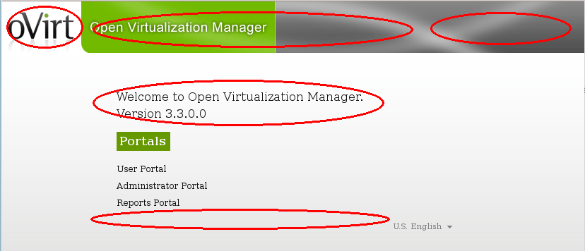
Welcome page
When a user initially goes to the oVirt engine web application, they are greeted with the welcome page. The welcome page by default has links to:
- The user portal.
- The administrator portal.
- The reports portal.
Branding allows one to add more links to the welcome page (for instance to extra documentation, or internal web sites). These links will NOT overwrite the above mentioned links, but will be added into their own section below them. The extra links are added by creating a template file just like the one found in packaging/branding/ovirt.branding/welcome_page.template. You can name the file anything you want, as long as you denote the correct file name in branding.properties.
The template file is regular html, but without the HTML, HEAD, and BODY tags. As the contents of the template will be directly inserted into the out welcome page. The template file can also contain place holder string that look like this: {user_portal}. While processing the place holders will be replaced with messages from the messages.properties file in the current user locale. All the keys in the messages.properties should start with ‘obrand.welcome’. One exception is the {userLocale} place holder. This will be replaced by the short version of the current user locale. For instance if the current user locale is ‘Spanish, spain’ then {userLocale} will be replaced by ‘es_ES’. This is to allow for link to locale specific files.
Besides the template the following aspects can be changed:
- Page title
- The header (left, center, right)
- The error message
- The link to forward to as well as the associated message for the link.
As illustrated by the following image:
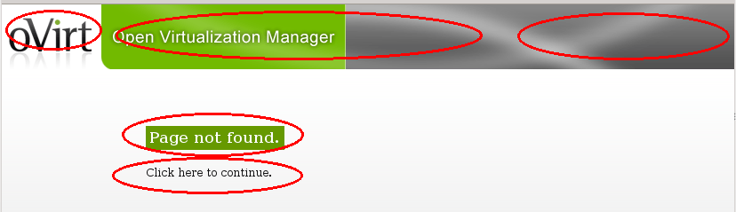
File not found page
Whenever a user goes to a page that is not found inside the oVirt engine web application, a custom page not found error page is displayed. We are able to customize certain aspects of that page not found page. The following aspects can be changed:
- Page title
- The header (left, center, right)
- The error message
- The link to forward to as well as the associated message for the link.
As illustrated by the following image:
 As the oVirt default branding is itself a branding theme you can look at the oVirt branding in
 packaging/branding/ovirt.branding in the source tree to see which css classes are available. The classes for the page not found page are in welcome_style.css. The page not found page shares a lot of the structure of the welcome page.
Adding new brandable styles
CSS
Because this is a GWT application most of the styles are compiled into the application when the application is built. As part of this process the style class names are obfuscated and they change each time the application is build. GWT provides some guidance on how to solve this problem here. In order to add new brand-able style classes the following will have to be considered:
- Any class name you define needs to marked with @external
- All the class names should start with obrand_ this is signify to theme authors that the class can be used to override styles.
- Any images normally cannot be changed with a style sheet, so we cheated a little and used style sheets to set the background image on an image tag. In order to not display a broken image icon you need to set the src of the image to something transparent and small. Luckily GWT provides an image like that already in ‘clear.cache.gif’
- Other than this any normal style properties can be set in your external style sheet.
For step-by-step instructions, see the README.branding in the root of the oVirt source code tree.
Text messages
GWT provides a mechanism that allows you to define messages for your application and have them automatically translated during the compile process if you have provided a proper translation in a standard Java properties file. GWT provides a ‘Messages’ and ‘Constants’ interface for this purpose. Since the translations are compiled into the application during compile time this does not allow one to use an external file to override particular messages. In order to solve this we pass a messages Javascript object to the GWT application using the host page. This object is then processed and used to override some predefined messages.
The available messages are defined in ovirt_messages.properties which is a standard Java resource bundle. The resource bundle is consumed and translated into a Javascript object and placed in the host page. Since it is a standard resource bundle you can have multiple locales.
For step-by-step instructions, see the README.branding in the root of the oVirt source code tree.